10.5. Where to Look for Your Results
OP provides a number of output files containing important information about the results of session processing. There are several ways to access these results.
10.5.1. Email Attachments
Once the processing has been completed, an email with the solutions will automatically be sent to the email address of the person running session processing as well as the project manager.

Fig. 10.10 The seven email attachments (sent to the project manager) resulting from session processing
For completeness, the seven different attachments provided as a result of session processing are given below:
.txt file provides the Processing Report. Note that the coordinates are clearly labeled in both the NSRS reference frame and the global reference frame (ITRF). More on how to interpret the Processing Report can be found in Section 10.3.6.
.gfile is the bluebook G-file, is an ASCII text file containing vector components, standard deviations, correlations, and processing information, in standard NGS “Bluebook” format (https://geodesy.noaa.gov/FGCS/BlueBook/pdf/Annex_N.pdf)
.vec file, showing vectors between user marks/CORS and the hub(s) (delta X, delta Y, delta Z and their associated uncertainties)
.sum file provides all the details of session processing
.snx file gives the GNSS solution in SINEX format (Solution INdependent EXchange format -an internationally accepted GNSS solution format)
.xml gives the session processing results (like the .sum file) expressed in an XML format
.serfil - associates the Mark ID (or Station ID for CORS), SSN, and PID (if it exists) of each Mark/CORS
10.5.2. Show File
All output files can also be reviewed within OP by selecting the “Show File” button under the Controls menu in both the Manager’s Page and in the individual mark pages (see Section 7). See Section 10.4 for more information on reviewing the Processing Report.
10.5.3. Session Pages
Some session solution information is displayed on the individual session pages. Session pages can be accessed from the Manager’s Page by showing “Results from” → ALL SESSIONS (see below):

Fig. 10.11 Select “ALL SESSIONS” from the Manger’s Page to reveal the results of any/all session processing
Selecting “ALL SESSIONS” will refresh the Manager’s Page showing the results of any/all session processing.

Fig. 10.12 Clicking on the session of interest in the “Occupation” table showing “ALL SESSIONS” will open the session page
Click on the session of interest. In the example above, we have selected session “2017-241-A.” This will cause the Session Page to refresh, showing the mark and observation information for that particular session:

Fig. 10.13 Mark information displayed on at particular session page
The Solution Quality Indicators (upper arrow) provide some indications of the quality of the solution, and whether or not the Solution Preferences have been met. The Data Availability graphic (lower arrow) should confirm the session span, as well as satellite tracking.
Although these visualizations offer a quick and easy way to assess solution quality, they do not provide much detail on how the data actually fit together, and for larger projects, may be cumbersome to review.
10.5.4. Mark Pages
Solution visualizations are also given in plots and tables under the individual mark pages (mark pages can be accessed from either the Manager’s Page or a Session Page). Make sure the correct session is displayed (see arrow in figure below):
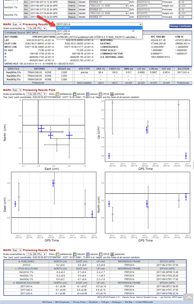
Fig. 10.14 Session results presented on a mark page
The Processing Results Plots and Processing Results Table show the a priori coordinate shifts which result from the session processing (see Glossary for more information on a priori coordinates). The shifts should be small.
The default uncertainties shown are one sigma (68.3%); the user can select up to 5σ. The symbols in the plot refer to the different sources for the coordinates:
 Orange shadded areas indicate where results that fail to meet project preferences will appear
 Gray circles are used for OPUS solution results
 Blue diamonds are sued for session precessing solution results
 Green squares used for network adjustment results
The plots are interactive and the axes scale automatically. Moving the cursor over a point causes the point to be accentuated and an information bubble to appear providing information about the point and identifying its source solution. The plots also interact with the Processing Results Table. Moving the cursor over a table row causes the corresponding point in the plots to be accentuated. For small projects, these visualizations may be sufficient, but for larger projects, the more detailed output files may be more efficient to assess solution quality.
10.5.5. Solution Statistics
Finally, once multiple sessions are processed, the user can see a summary of how the sessions compare by selecting “Solution Statistics” in the table under the map on the Manager’s Page.

Fig. 10.15 Session Solution Statistics are available from the Manager’s Page

Fig. 10.16 Example of session solution statistics
Tip
Users can copy and paste the Solution Statistics table into a spreadsheet and thence sort by columns to discover where the largest errors reside
Tip
For larger projects, it may be more efficient to analyze the output files instead of the visualizations provided within OP